![]()
Vector Based Analysis
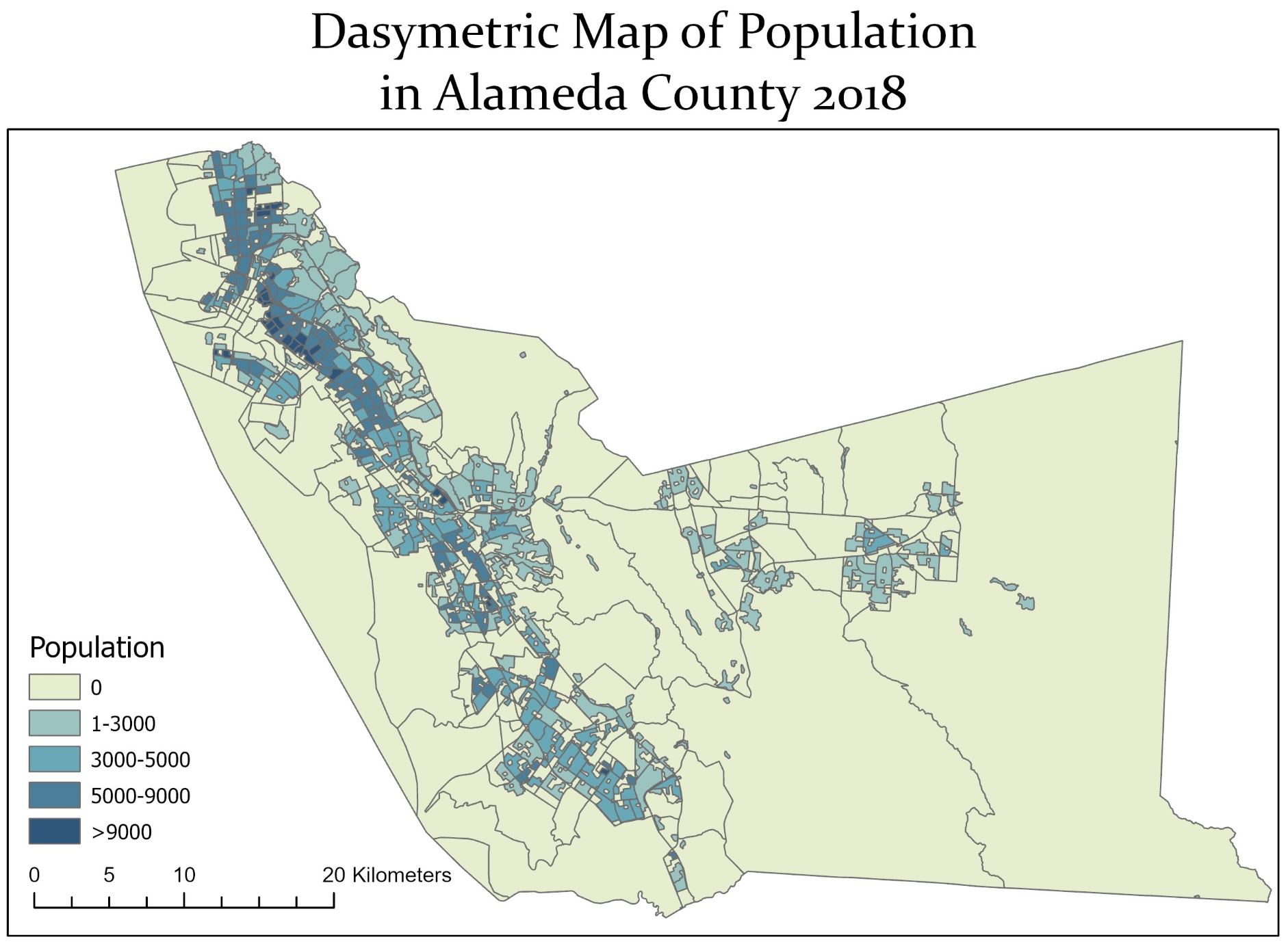
Vectors are lightweight shapefiles ideal for analyzing known information about a study area. Examples include survey points or census blocks. Knowing how to handle vector data well is one of the basic skills any GIS analyst must have. Pictured above is a Dasymetric map of Alameda County, California. Dasymetric maps are made by taking multiple sources of data and using one or more to refine another. Here I have taken the populations of each of the census blocks and restricted their display to just where the landcover is classed residential. In this way we can avoid some of the generalizations and bias present in raw census data.
![]()
Raster Based Analysis
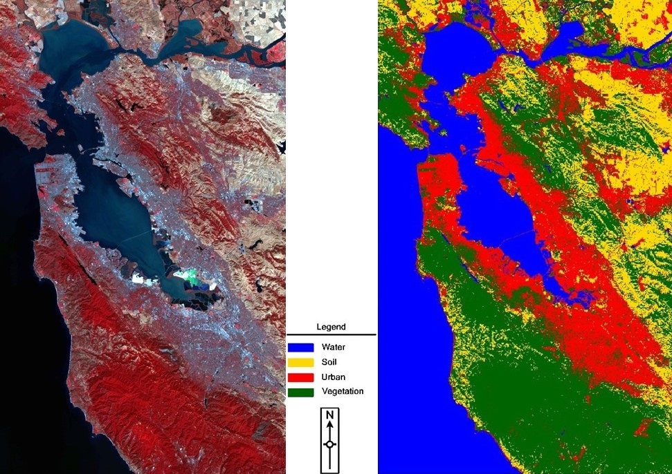
Rasters are continuous pixel files ranging from satellite imagery to digital elevation models that describe the terrain of a region. Vector and raster GIS are the two primary forms of analysis a GIS analyst must master in their field. Pictured above is a classification made in Erdas Imagine of Sentinel 2 satellite imagery showing the extracted landcover in the bay area of California, 2016. By taking the imagery and refining it to display its data categorically we can use it to run analysis or make inferences about the data. Being able to take imagery such as this and transform it into a useful deliverable is at its heart the essence of raster based analysis.
![]()
Spatial Data Science
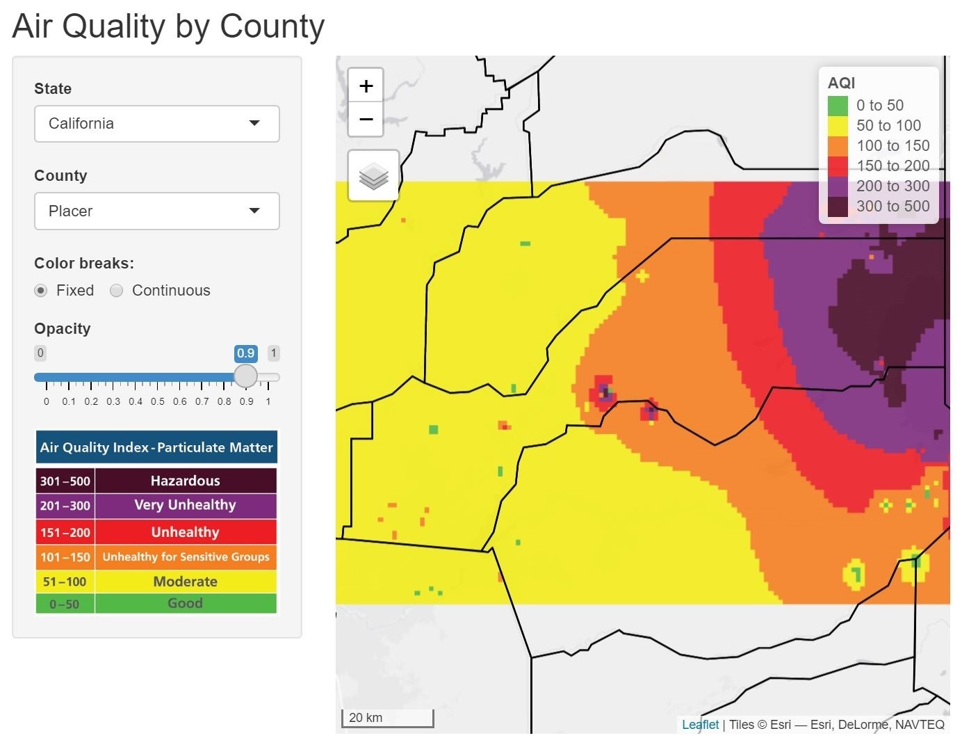
Spatial data science allows analysts to extract deeper insight from data using comprehensive sets of analytical methods and spatial algorithms. Spatial data scientists try to make sense of spatial datasets to better understand the system or phenomenon they’re studying. Pictured here is an app I wrote in the R programming language to derive a raster surface interpolation of air quality data being streamed from Purple Airs API. Interested in learning more or launching the app? Check out the data science entry on my dashboards page for more.
![]()
Geospatial Models
Taking data from multiple sources, resolutions, wrangling the data together, and making an intuitive map is at the intersection of cartography and statistics. These are mapping solutions to real world problems. Whether it be hazard maps taking into account many different variables, or habitat suitability models sifting through tens of thousands of observations. Pictured here is a weighted sum model of a warbler species in Marin County, CA. This species favors higher altitudes, taller vegetation, and wooded areas. This model takes all of those into account. Built in python it can easily be adjusted for different species, or inputs. Want to see my code? Check out the last entry on my programming page or find the script markdown here.
![]()
Dashboards
Dashboards can display a multitude of different information, from simple analysis to interactive web maps. But knowing how to design and publish webmaps requires certain skillsets. And to take a web map the step further into a web app takes substantial programming knowledge. Interested in my dashboards? Check them out here.
![]()
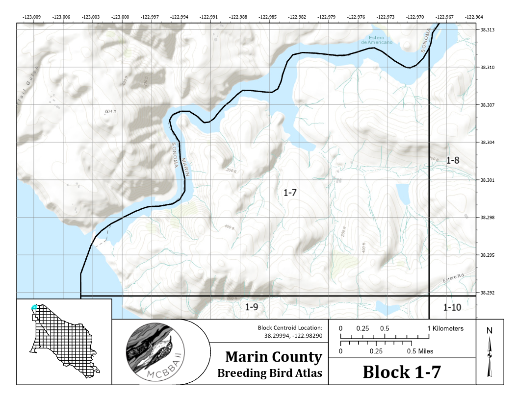
Paper Maps
For many projects, especially when documentation is a priority there is just no substitute for paper maps. Knowing how to use space in multiple formats with intuitive keys and color schemes is critical for this type of mapping.